Introducing Hydejack 8
in blog
After a long wait, Hydejack 8 finally sees the day of its release. It makes Hydejack look more elegant (no more super bold headings) and introduces features that make your site more impressive to first time visitors, while loading faster for repeat visitors.
Cover Pages
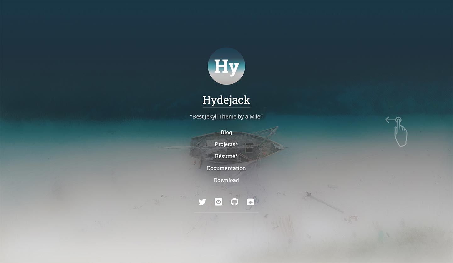
The new design doubles down on Hydejack as your personal site. The new Cover Pages let visitors know what you’re about at a glance, showing your logo or profile picture, tagline or description, and selection of social media icons.

Sliding over a cover page will reveal the content below.
Lazy-Loading Images
Using lots of images can severely impact the performance of a site. It can also cause layout quirks when images pop into existence.
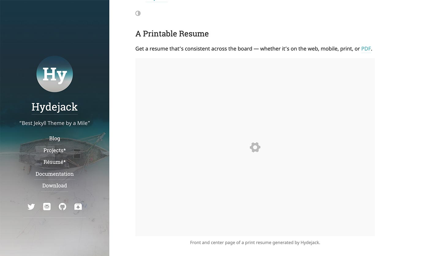
In Hydejack 8 you have the option to provide width and height information for your images and let Hydejack lazy-load them as readers scroll the page.

Images are loaded as they are scrolled into view.
Better Blog Layout
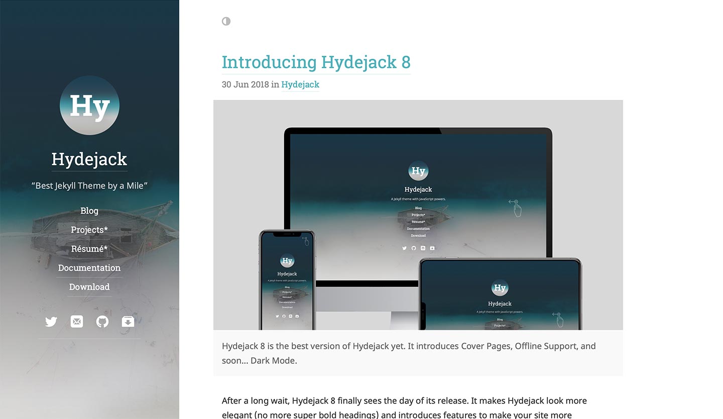
The blog layout finally catches up to modern design standards and renders a posts’s image as part of the preview, giving it a tastier look that makes visitors more likely to engage.

Hydejack’s improved blog layout renders each post’s image.
Dark Mode 🌗 (coming soon)
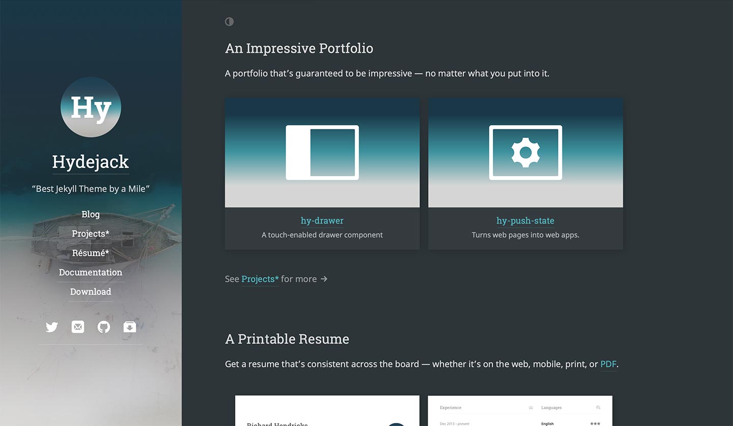
In 8.1, buyers of the PRO version will have access to Dark Mode. At your choosing, it will be enabled by default, enabled based on visitors’ local time, or flipped on by a switch.

Hydejack switches between light and dark mode fluidly.
Offline Support ⚡️
Version 8 introduces experimental offline support. This allows visitors to navigate your site while offline and continue reading articles when connectivity is lost. It also improves loading times for repeat visitors dramatically.